Visual Hierarchy
Communications Studio Fall 2019
10.29.19
The goal of this project is to learn about graphic design principles including hierarchy of information, color, imagery, and scale. I was assigned to go see the opening night of the Pittsburgh Short Film Festival along with Jamie, Jina, and Sarah.
Our first step of the project is to make (minimum) 12 posters using only one typeface and using only the information given to us on a page. There are four different sets of posters we have to make:
- Show hierarchy using only different stroke weights
- Show hierarchy using line breaks (no more than one space between any two lines)
- Show hierarchy using horizontal shifts (only two different alignments)
- Show hierarchy using horizontal shifts (only three different alignments)
We started these by discussing in each of our groups the information which seemed the most important to the information that seemed the least important on the pages given to us. We determined the following:
- The event name is most important followed by the dates
- Date of the opening night less important than overarching dates, but more important than the times of the different showings
- Time and name of the film showings are more important than the names of the short films playing in each of the showings
- Location of event and website are important, but not as important as the event/dates (debates over where in the hierarchy this should be)
11.1.19
Jamie, Jina, and I all were able to go to the first showing of the film festival (Sarah was busy during this time and had to go see a different showing). There was a whole array of various stories, but there was an underlying theme of family, love, and dreams. I walked away from this showing feeling very warm and fuzzy on the inside, and I really had the sense that those who ran this festival and the attendees are here for the love of the craft and to support these smaller artists.
Content-wise, I do believe this will be a fun challenge to try to convey the essence of the film festival, but because there are so many nights, shows, and types of films, there is no central message that can be easily shown like one could do for a play, for example. However, I did have some central words/phrases that I took away from this showing:
- Passion (for film, storytelling)
- Variety (so many different voices and stories being told, from 6-year-old Milo to 73-year-old Rocky Bleier, fiction to non-fiction)
- Community (surrounding local/small artists, many people going with friends/family, directors from other nights here to support other directors)
11.5.19
We analyzed our type posters for Assignment 1 in class today; each group had to analyze a different set of posters. As a class, we determined some key takeaways:
- Less is more—be thoughtful with how you use contrast to make the areas with contrast more meaningful
- Macro vs Micro—there is an overall hierarchy of the poster and smaller hierarchies within chunks of content
- Spacing—large spaces around small words can create large areas of contrast
- Shapes—shapes created by type (created by both positive and negative space) can create movement on the page, make a composition feel unbalanced, and/or create contrast depending on the white space around certain blocks of text
For the next assignment, we are adding another layer of contrast: color. We used words from a word dump from class to help determine the color schemes that we wanted to use. The words I want to use for my colors were “vibrant,” “friendly,” “diversity.” For this I am planning on using an analogous color scheme, using reds, yellows, and purples. I want the welcoming feel of warm tones and the contrast of a cool tone in order to make the poster still have a sense of boldness.

I chose to use a rather vibrant red and yellow for my color pallet accompanied by deep indigo. The red and yellow keep the fun spirit of the independent creators but the purple grounds it to keep the sophistication of the event.
I found a purple that I really liked on print, so I played around with the reds and yellows to find the best compliments. I chose to layer the swatches differently to see how the colors would react when one was more dominant than the other. I chose to use the first swatches of red and yellow because their vibrancy contrasted nicely with the darkness of the purple.
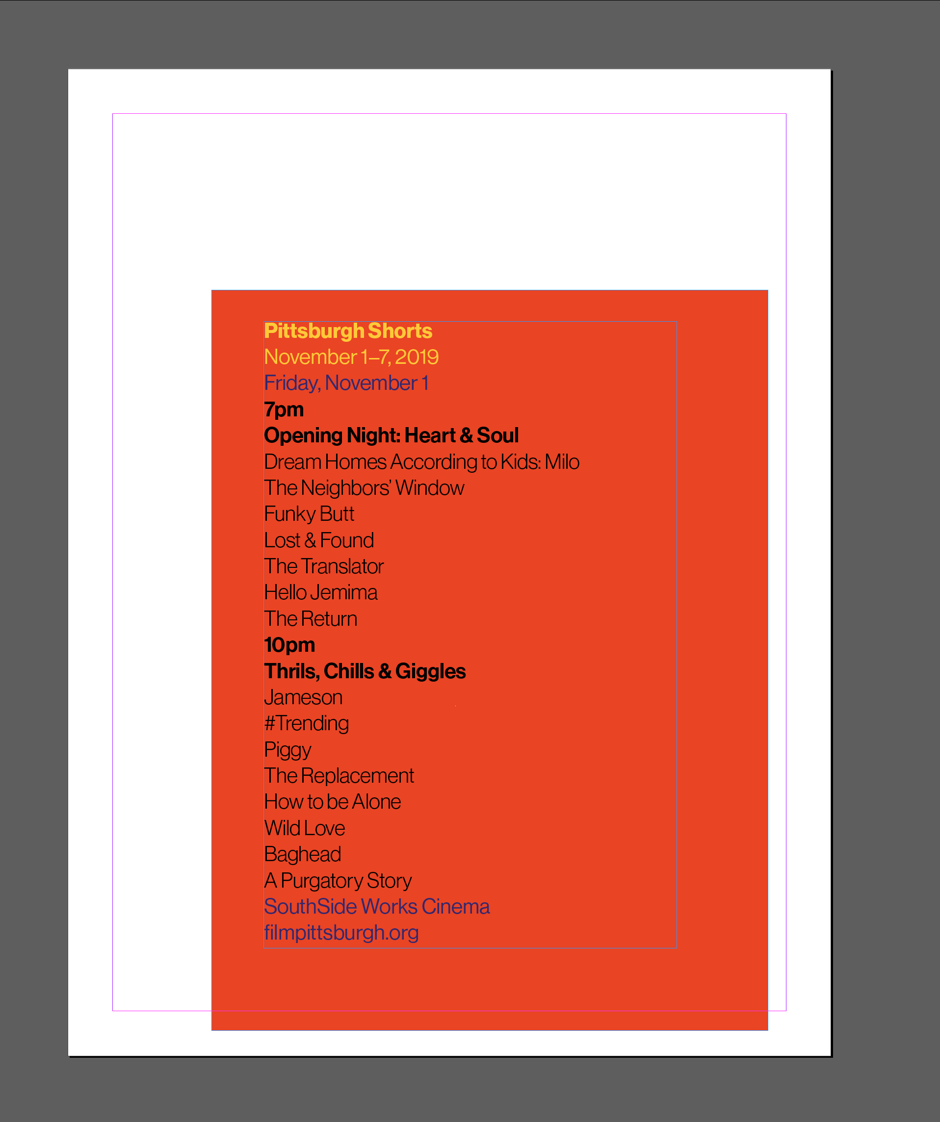
I played around with the colors on the posters a bit taking two main approaches: color blocking and full-bleed backgrounds.


I made a few conclusions from these experiments:
- Yellow was not the most effective background color—it is alarming and much more pleasing to look at when used as an accent color; more effective as an accent color on purple than red
- Red was good as a color block but was too overpowering when used as full-bleed; good for the accent color on both yellow and purple
- Purple was a better color for full bleed, felt too heavy with that text block; very good for white text; good background color for both red and yellow
I chose to make another poster based on the conclusions above:

This poster tried to combine some of the principles from above. I used the purple color block again but moved it up to balance out the large amounts of text below and keep the composition from feeling too bottom heavy. I also wanted to use the color block to add hierarchy rather than just be a decorative piece, so I used it to add contrast between the event name/dates from the rest of the content. I tried to connect the location and website back to the other overarching information by using the same purple. I also decided to only use the yellow for the title because it contrasted the purple nicely and added another layer of importance to the event name. Additionally, I changed the time/showing name weight to match the film title weights so that it didn’t seem as important as the date for those showings but still felt more important than the individual films themselves. I finally made the film titles a gray so because the high contrast between black and white felt too jarring and ruined the hierarchy that I had built; the gray is still readable when close, but is not overpowering at a distance.
11.6.19
I struggled a lot more with the scale exercise than I thought I would. The assignment loosened the constraints that were on the previous exercises, and not having such strict guidelines seemed almost overwhelming. Two words stood out to me on the assignment sheet: be bold. I stayed with pretty simple structures at first. I used each one as a starting point and tried to build on the “boldness” with each iteration. In order to be more “bold,” I played around with larger blocks of white space and created more unique shapes with the text.

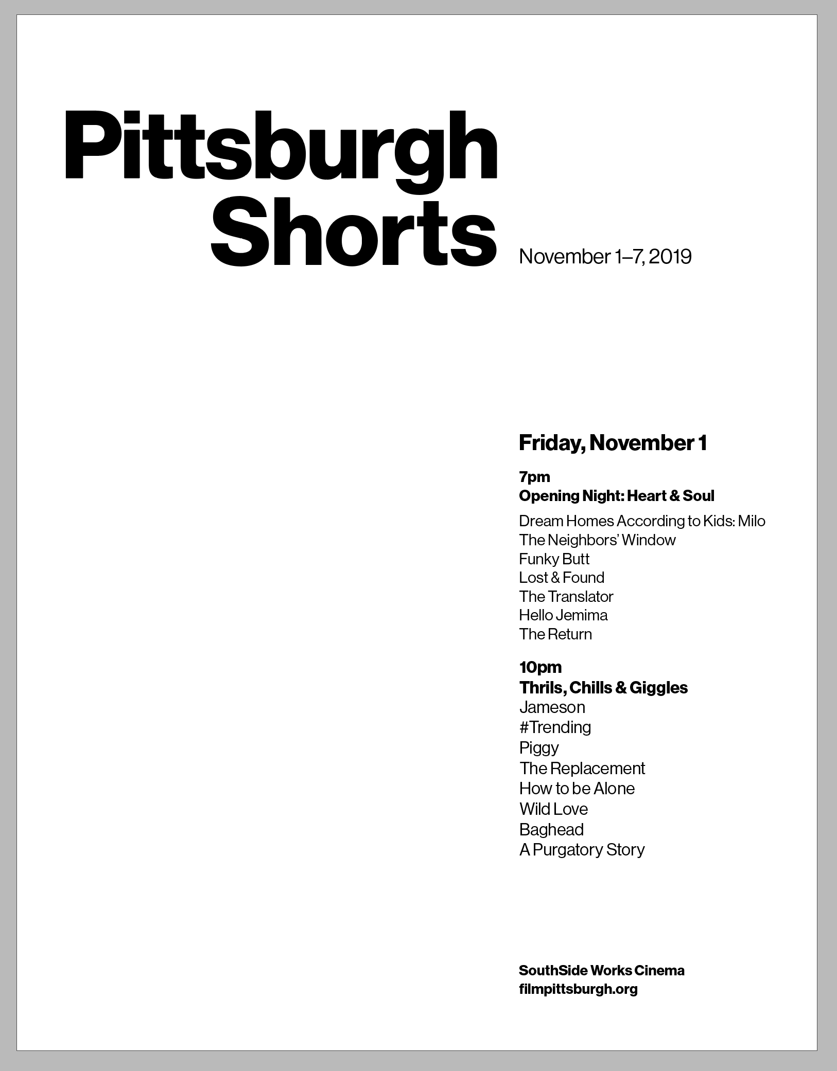

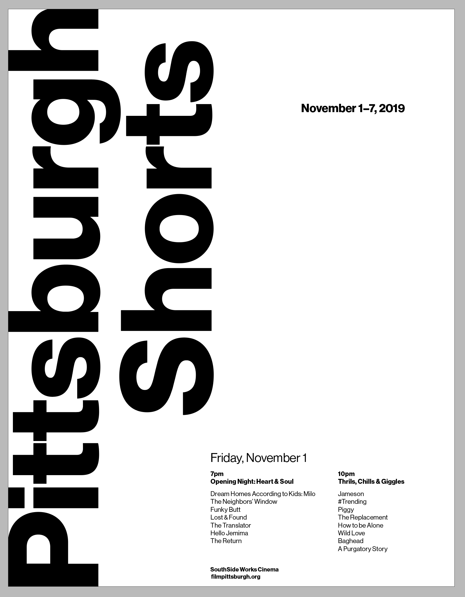


Of these, I believed the bottom right and the bottom left posters were the most effective with my original goals in mind. They are the most unique in terms of shape and white space.
11.7.19
In class, we critiqued the posters. I personally found that the most effective color posters had some sort of more muted color accompanied by a brighter one, and I was drawn to complementary colors or near complements. For mine, I would change each of my colors to be less saturated. From a distance, my posters did stand out because they were so bright, but that was almost a downfall because the colors were hard to look at for an extended period of time. Having a deeper color (maybe the indigo) would help keep the color pallet, but make the poster feel more comfortable. My scale posters I believe did stand out in a more positive way. The compositions were more unique and drew in the eyes a bit more. Vicki and Sherry were not fans of the sideways text on the bottom left poster in the images above but encouraged me to keep playing around with the large areas of white space around small areas of text to add hierarchy.
The next part of the project was to move onto tabloid-sized paper and try to play around with images. I have no idea how my scale exercises will translate on larger paper; I think they are nicely formatted for letter-sized paper and will greatly change with the new paper size. However, I am hoping that it will be rather easy to find an image that will fit nicely into the white spaces that I’m creating in those compositions. I am less tied to my color pallet, so I won’t limit the images to using colors similar to the red, yellow, and purple.
11.10.19
I struggled to find images that balanced between cliche and abstract. If it swings too much towards the expected, the viewer does not feel challenged and therefore is not interested. However, if the image is too abstract, it makes the viewer work to hard to make connections between the imagery and the content and therefore gives up trying to understand the poster. The other points I tried to balance was whether I went with an actual photograph or a more graphic representation of something. Therefore I tried both to see which was a more promising direction. One option I tried was a vector drawing of a laurel branch, a common symbol in awards, and the other option was a photograph of a film strip. I tried to use my type scale exercises and use the same hierarchy along with the images, but in order to set more constraints for myself, I avoided color to try to see how imagery could interact with my type.
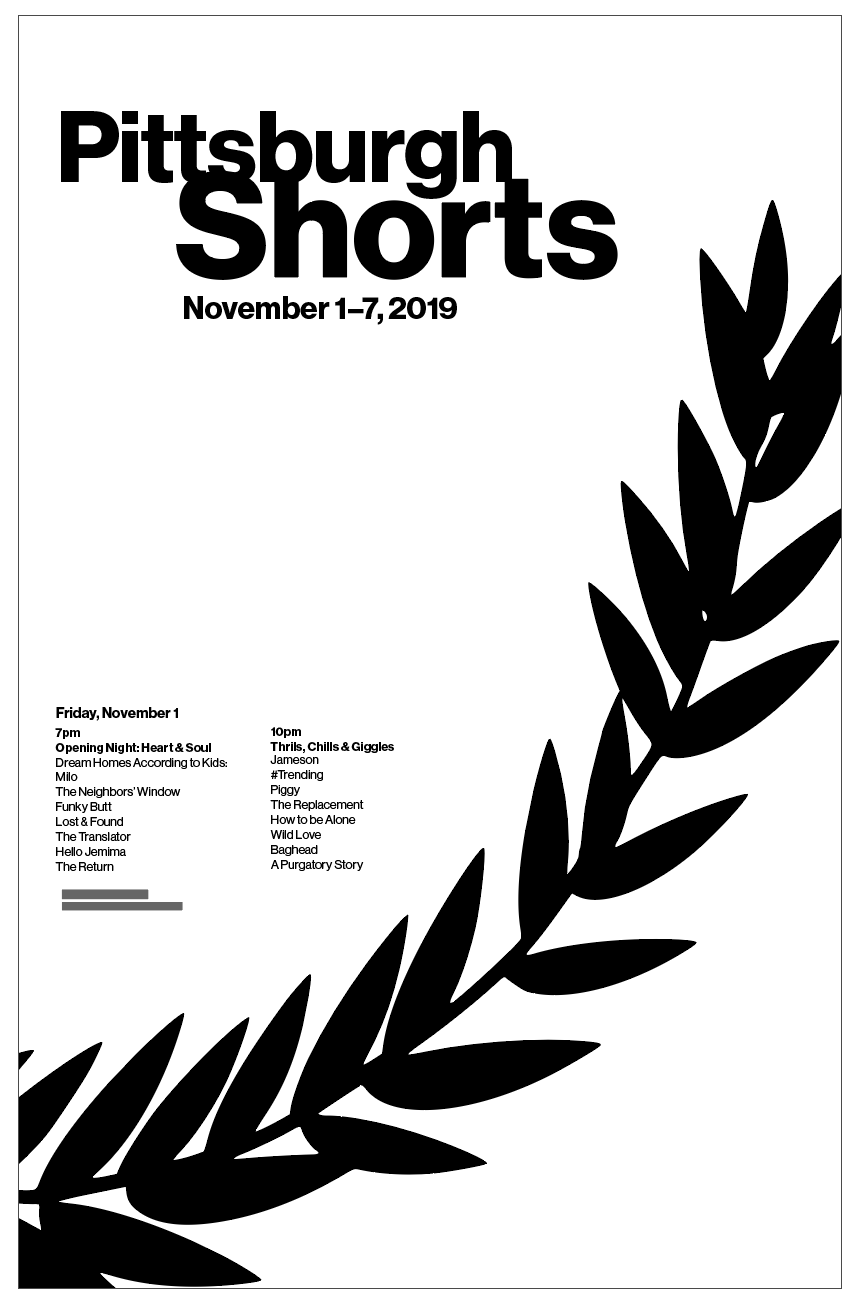


I personally do not believe that either of these was that successful. However, of these two, I am more drawn to the photograph. However, it feels dark, and as Mason said, it looks like a poster for a true-crime show. Maybe color could change that? Nonetheless, I think both images were almost too obvious, and I want to try to be a bit more abstract with the work.
11.11.19
Because of how dark the previous iterations were, I decided to try to venture more into the world of color and abstraction. I also got a suggestion from Sherry to maybe try playing around more with scale—maybe making the scale less dramatic to lean towards Swiss typographic design, a style that I personally love. I started to play around with these changes to type first without images in order to reduce complexity. Therefore, I revisited the color exercise.

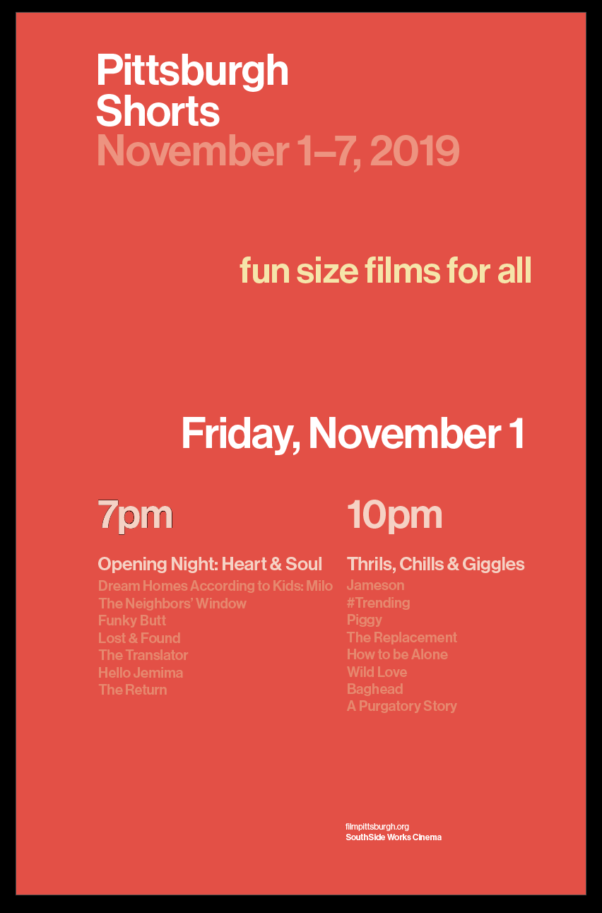


From my first try with color, I do think that these are more comfortable to look at, and the micro hierarchies worked for me. I was not sure exactly what to think of the greater macro hierarchy, but I chose to leave it to see if it would work when adding imagery.
Moving into finding more images, I tried to look for things that were abstract but still film-related. One of the first things that came to mind was the broadcast error screen shown on TVs, so I tried to find images that reminded me of those colors, shapes, etc. to work with.


I made various iterations using each of these three images, but I still felt like they were not working too well. However, I printed them for class to see if it was a step in the right direction.
11.12.19
It was interesting to look at the wall during class, especially for the short films. Everyone had different interpretations of how to portray the event.
Overall, my posters were not really working. The images were too abstract, and the hierarchy of information got lost in my attempt to go more towards the Swiss style. For the next iteration, I think that I will go back to my original type hierarchy and try to find new images. Vicki also suggested going back to the first image that I had of the film strip and adding some color back.
11.13.19
Unfortunately, the colorized images of the film strip were not working, and I tried some other new images which I did not enjoy either.

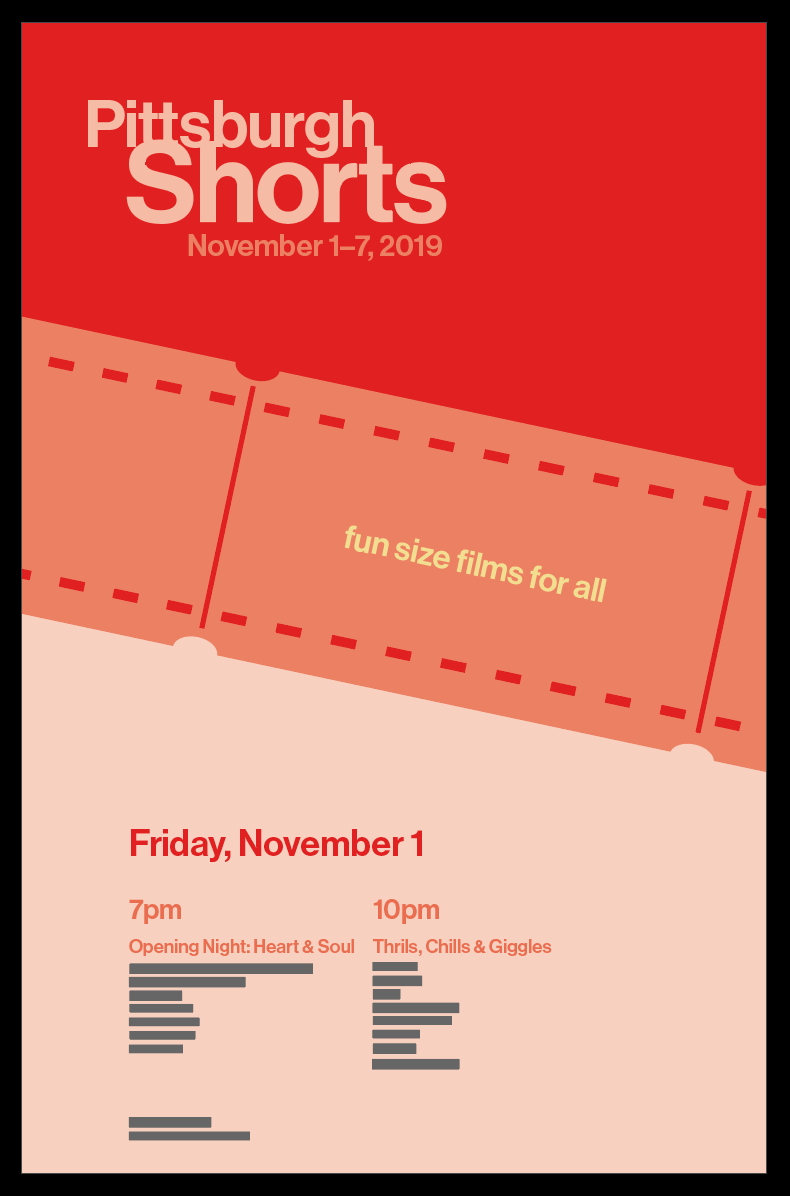

When I talked to Vicki, I deleted a background image to replace it, and the type hierarchy was working really well. We talked about stripping back the importance of an image, and instead only using type or using a small thumbnail of an image. I wanted to challenge myself, so I decided to play around with a thumbnail.


I chose to try some different photos to see how each one would change the mood of the poster, and I thought the image on the right was a better balance of the darkness of the first photo and the playful colors of the middle one.
When I got feedback from peers, they believed that the image seemed too disconnected from the rest of the photo and the background was too bright, so I took those comments into account to create the following poster:

This was the poster that I turned in for the final crit. Some feedback that I got to change further is the image—it was too busy and did not work well small— the color of the background—it was too dark and did not encapsulate the feeling of the festival— and the image/text interaction—it felt cramped and lost the original purpose of using the hierarchy.

