Typography
Communications Studio Fall Mini 2
11.19.19
The goal of this next project is to understand some of the principles of typography through a critical analysis of a given typeface, while also further developing our skills learned in the last project through a spread and learning how to effectively use time-based communication through an animation. All of these projects will be on the typeface Plantin, which was introduced to me on a piece of paper that read the following:

At first glance, Plantin seems to be a very standard serif. It looks rather old, classic, and may be used for books. However, the longer I looked at it, the stranger Plantin looked. First of all, Plantin is very thick. The strokes are extremely wide, and there is very little contrast in stroke weight. Everything about Plantin is very squat as well; the ascenders and descenders are short which makes the typeface seem pretty clunky. Lastly, I noticed how quirky the details are in the typeface. One detail that I noticed was that the counters in the letters “o,” “g,” and “p” are tilted. It‘s small, but it adds something dynamic to the typeface. It also has some triangular serifs, something that I have never seen before, and it only has it on some of the letterforms as well.
When I actually researched the typeface, I learned some pretty interesting things about it:
- named after Christophe Plantin, a 16th c. printer
- created in 1913 by Frank Hinman Pierpont for the British Monotype Corporation (patented the hot metal typesetting system)
- the inspiration for the typeface came from Gros Cicero by Robert Granjon, seen by Pierpont in Antwerp at the Plantin-Morteus Museum
- created in response to papers being coated and smoothed (less ink spread)
- Monotype wanted a new letterform to add to their collection for printing use (only had limited options at the time)
- wanted the typeface to be thicker and bolder than those being used at the time (thin to look elegant and to avoid too much ink bleed making things illegible)
- exceptional legibility, used mostly for newspapers
- well-received and became extremely popular, popularity even translated into the digital realm
- the main typeface of Monocle
- inspiration for Times New Roman
- about the typeface: large x-height, short ascenders and descenders, avoids bulkiness through sharp serifs, wide strokes, firm serifs, compact but still readable
I then wrote an essay using the research above with the intention of balancing the history and details of the typeface as well as a short excerpt from the essay.
11.20.19
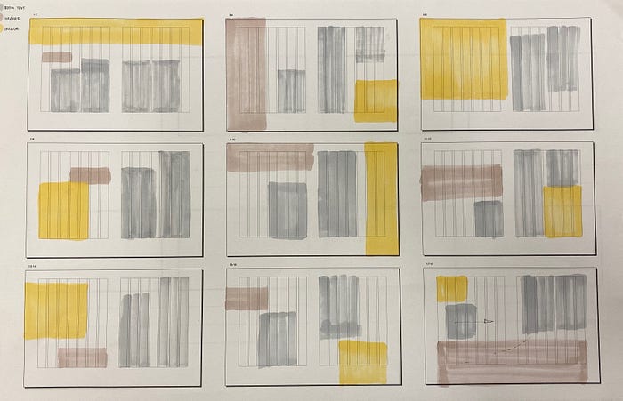
The essay that I wrote would then be turned into a spread, so I made some quick thumbnail sketches to explore some ideas. My goal during these thumbnails was to try to break the grid in unique but responsible ways with the image and title.
I also started to look for images to be used in my spread. I wanted the image to be an abstract reflection of the typeface: bold and strong, yet traditional and classic. I found the following images that I thought played on each of the adjectives in various ways:
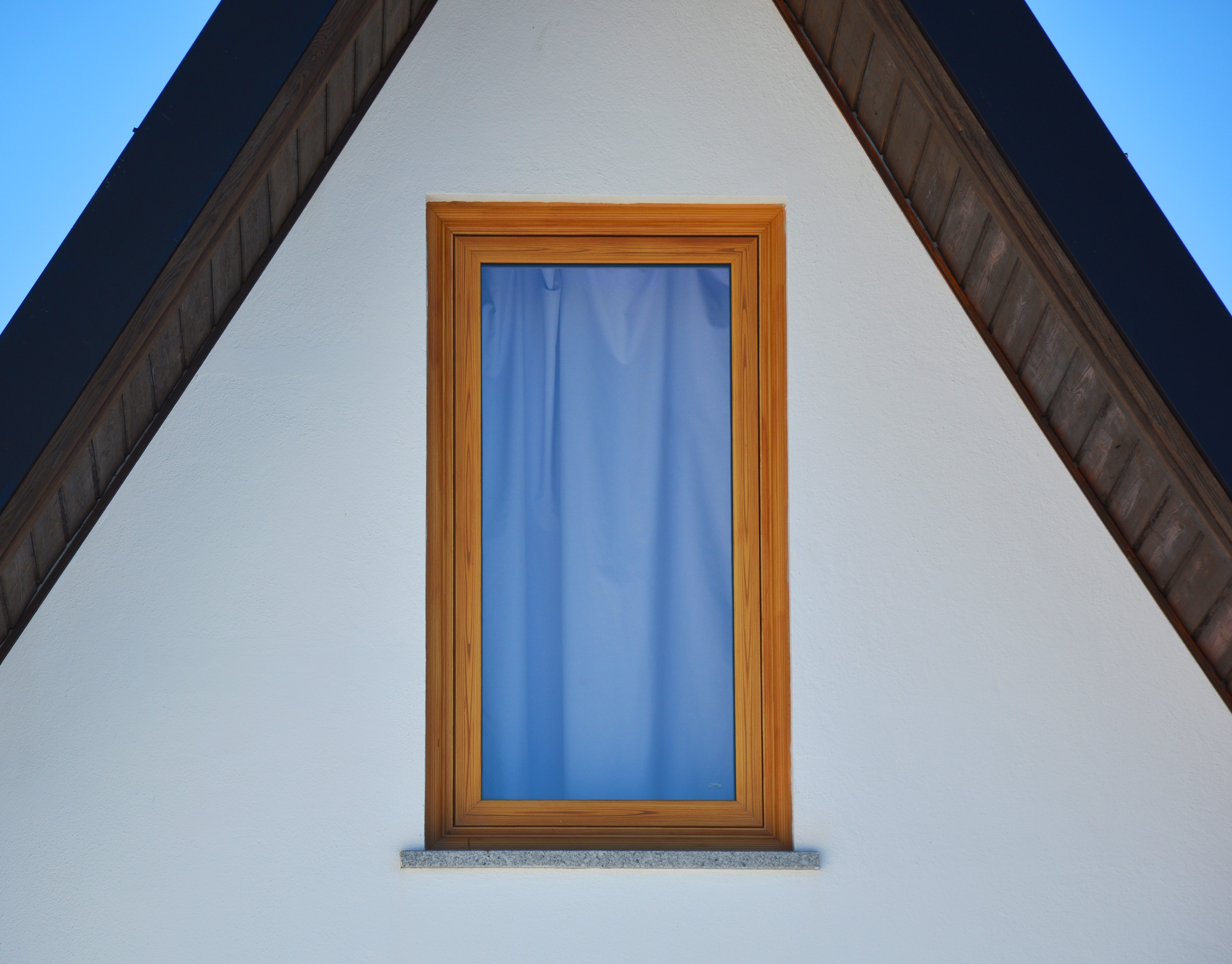
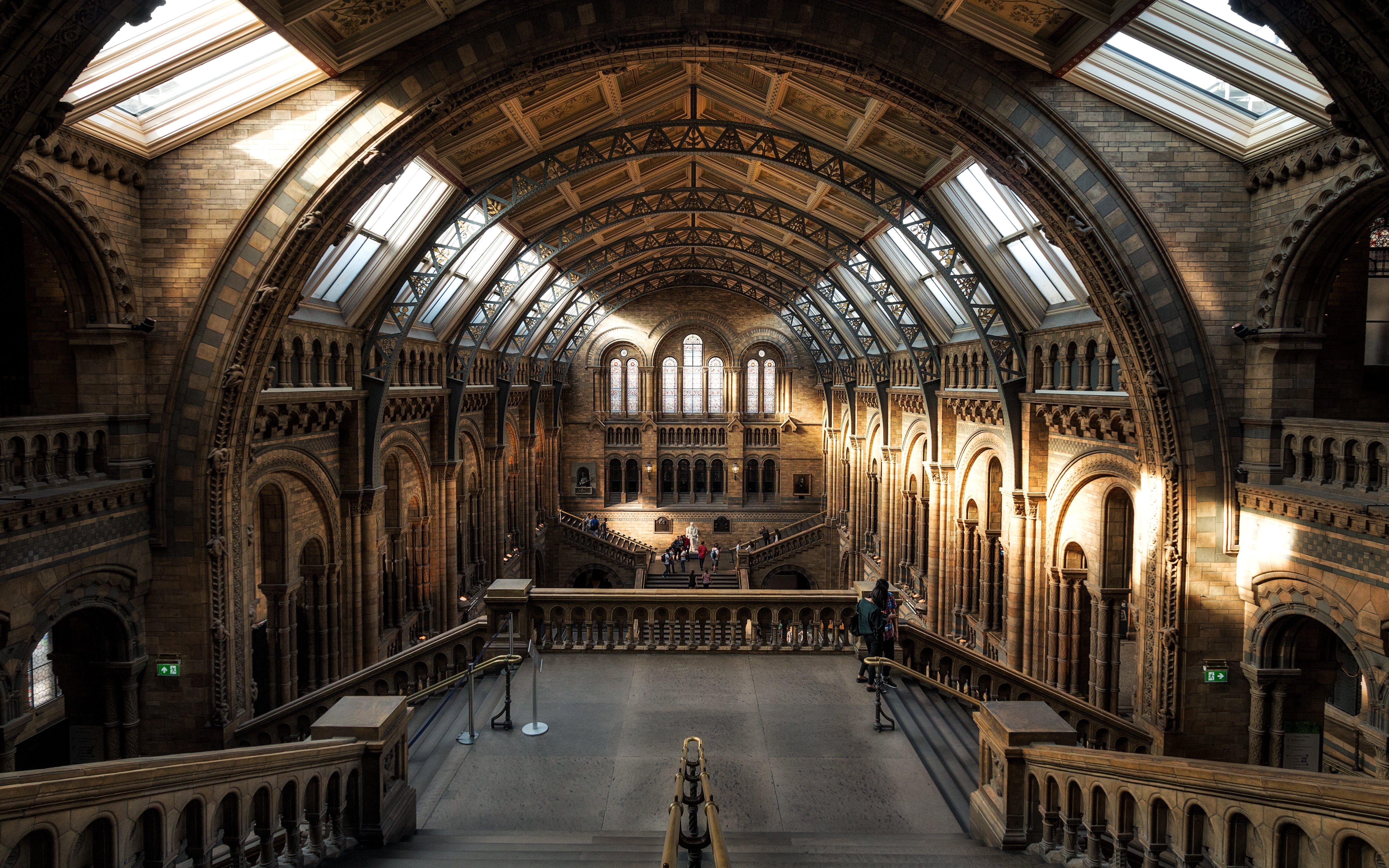
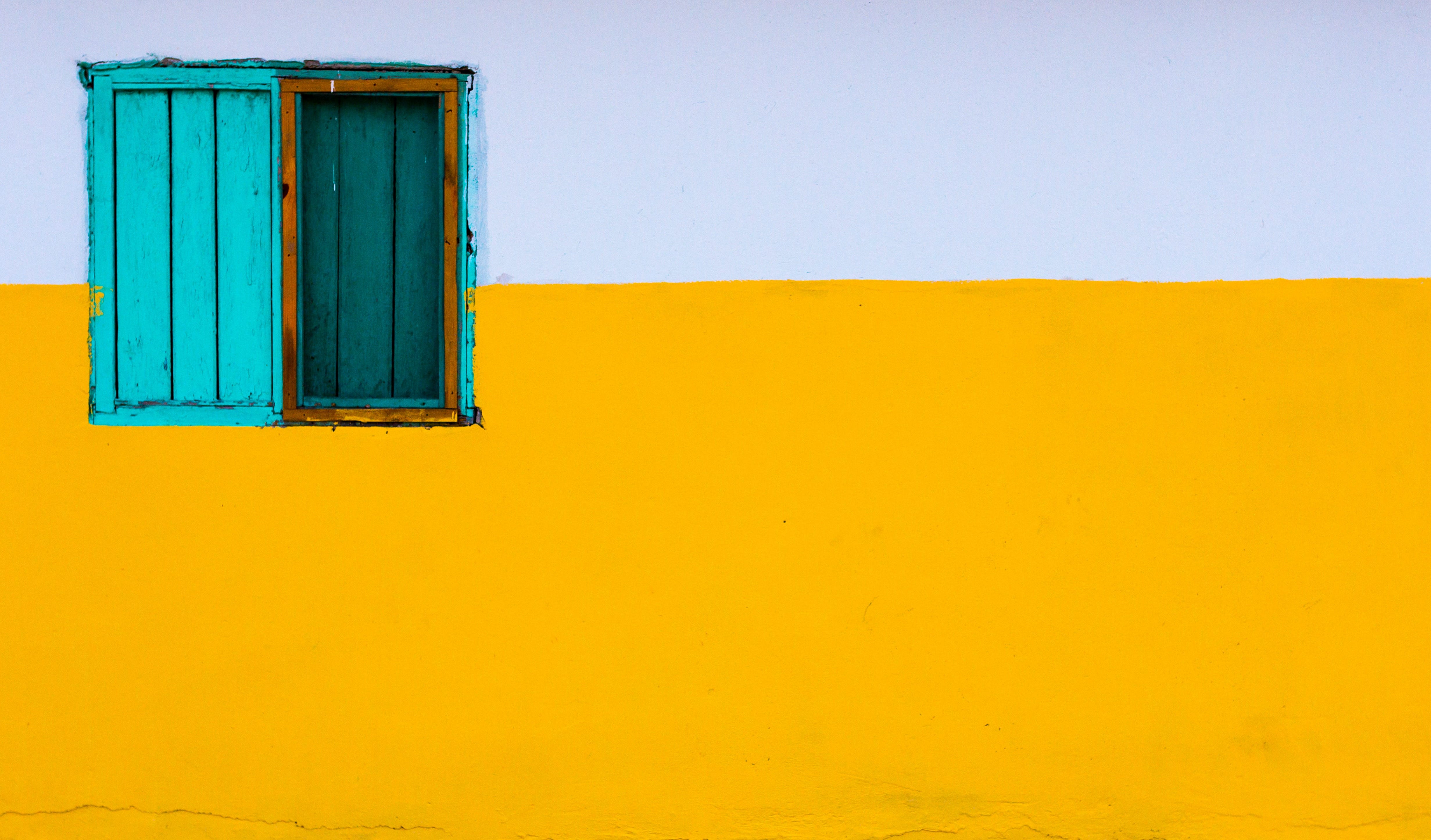
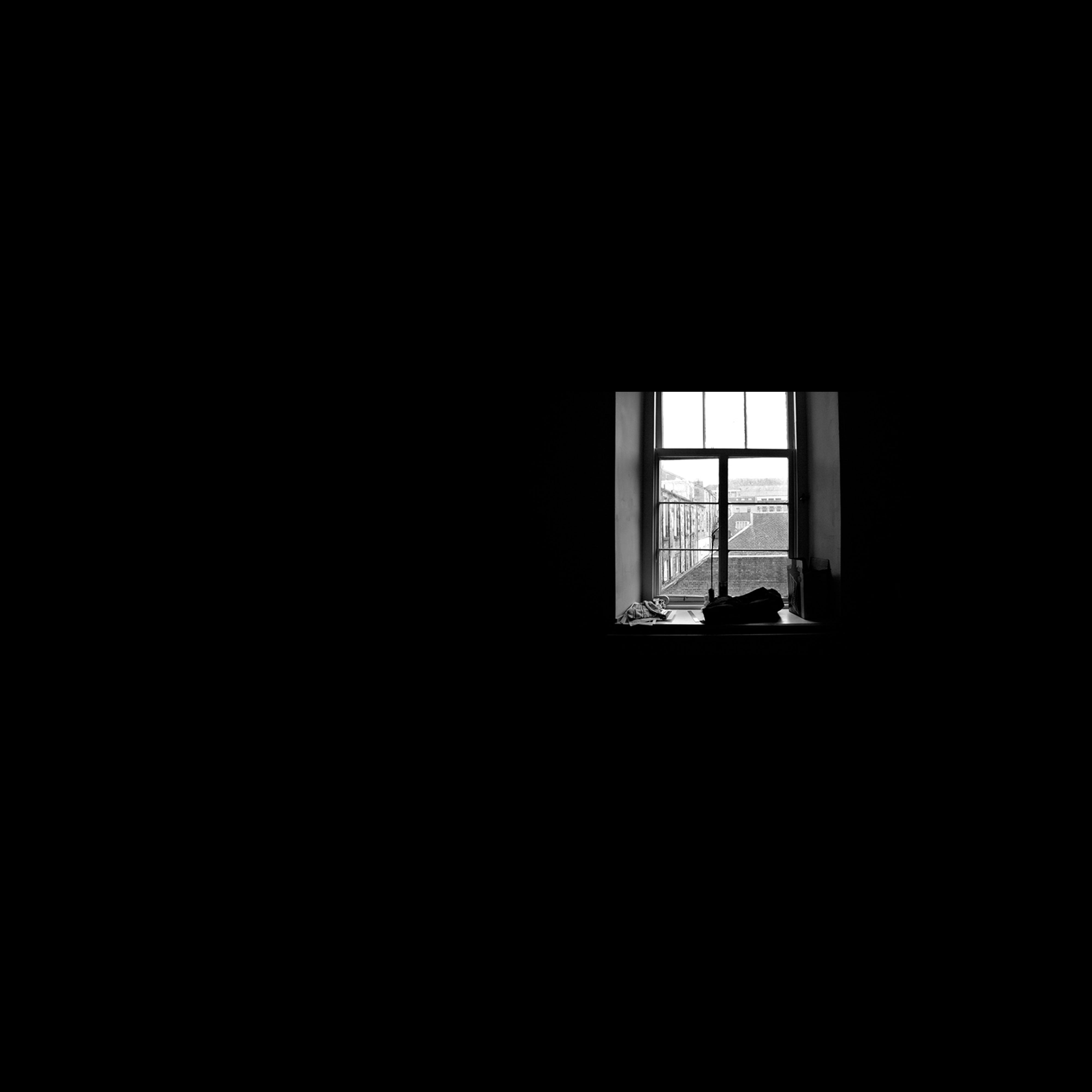
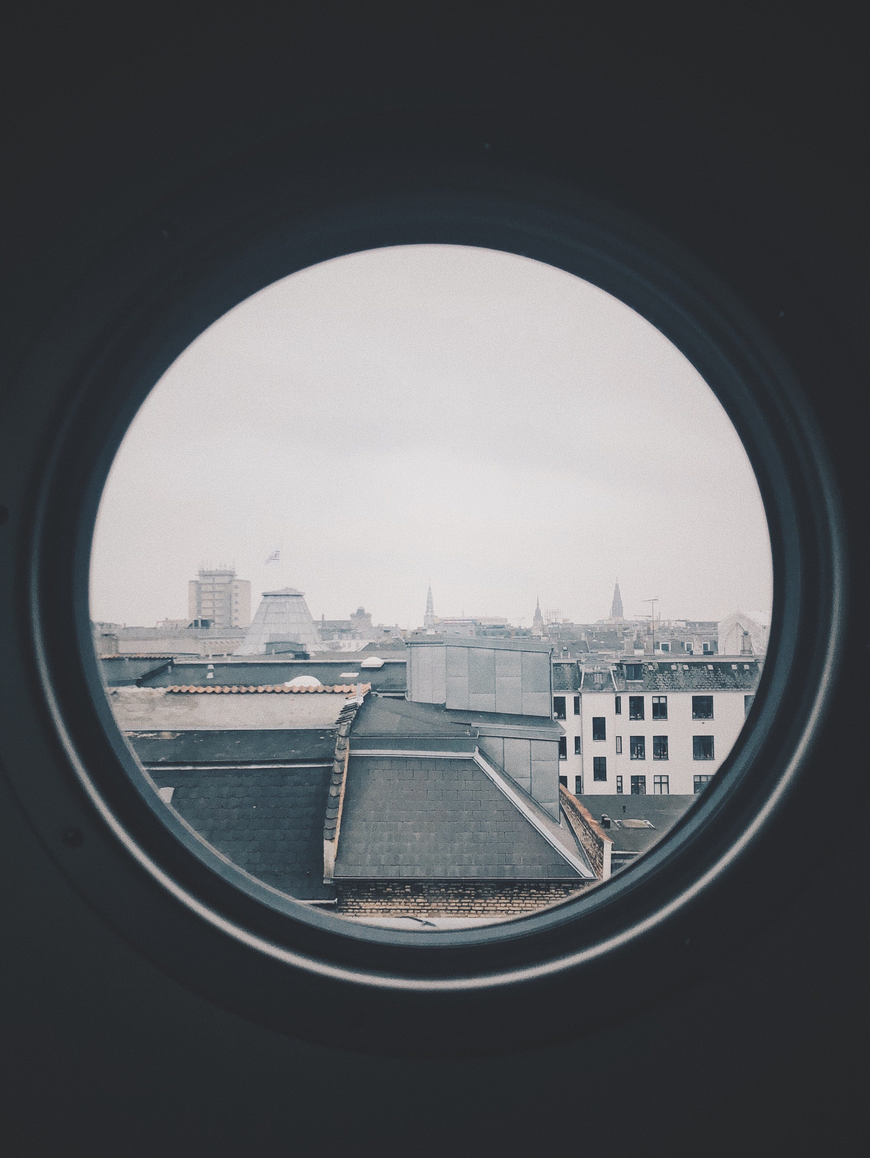


However, I found an image that I thought balanced all of the adjectives well:
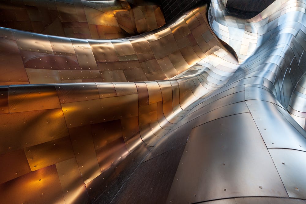
What I liked about the image is that it was a metal surface that has the qualities of fabric. It reminded me of the ironies that are present in Plantin and the overall quirkiness of the typeface.
11.21.19
Once I found my image, I started to work on the spread. I translated some of my thumbnails into rudimentary spreads:


Once I placed the elements I had, I began to add color (I used the rust color and light blue from the image) and create additional elements. I created a graphic that highlighted some of the fun characteristics of Plantin’s letterforms and wrote a short caption which related the image I chose to the typeface.
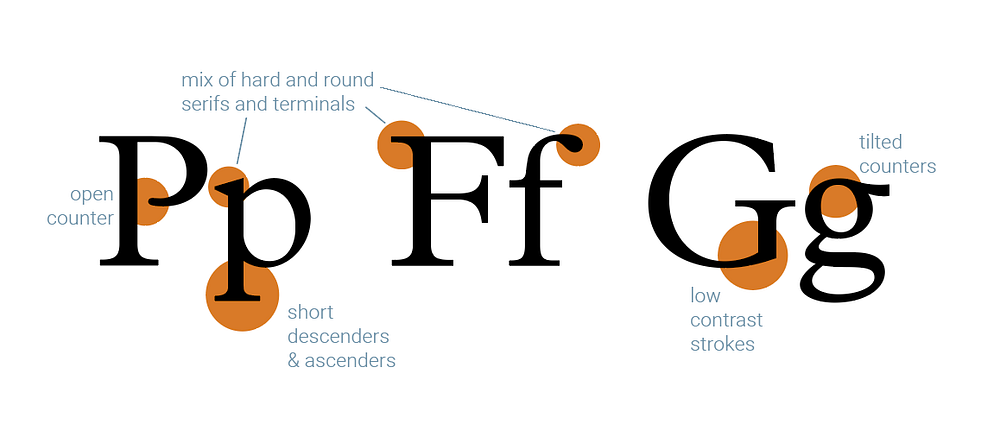
I took my favorite spread from the first round of rough layouts and continued to develop it with the new elements.


I started with the spread represented on the left. At first, I had just used color to highlight the first few words of my essay as an indicator to start reading there. I wanted to add more color to the spread so that the orange elements not in the photograph were not just on the right page, so I also made the title in the same orange color. However, it looked too similar to the beginning of the essay, so instead, I inverted the color. I then ran into another issue where the pages weren’t cohesive; it was too split down the middle with nothing other than color tying the two sides together. Therefore, I dragged the orange across the centerfold to try to bridge the gap as well as create some tension between the shape and text to also indicate the start of the essay. The spread then felt so orange heavy that I decided to try to switch out the orange for the blue that I used for captions, using black text instead of white for more contrast. To tie the sides together, I made the dot of the “i” orange to make it a sort of motif in the spread. I then ran into yet another issue when I printed—the extended color block did not translate well into a folded spread; it looked like a mistake.
That was when Vicki came to my rescue. She suggested that instead of making the color block extend over, use the image to cross the center, and utilize spacing to create emphasis on the title instead of color. I began to play with these suggestions before our one-on-one the next day.
11.22.19

I decided to keep the dots to add some more cohesion between pages, making it blue to contrast the rust on the image. I tried using a blue half-dot on the right page too, playing around between adding it directly across or below, indicating the end of the text. I also added sources in blue Roboto at the end of the essay to show its relationship to the text, while keeping it separate. I chose Roboto for my supporting text because it compliments Plantin well—they both have large x-heights, are compact, and it is a sturdy sans serif. I also added some page numbers in the blue on the bottoms of the pages. These were Vicki’s comments:
- the blue dot on the right was unnecessary
- text is really big; Plantin is readable, so it’s okay to go smaller
- once the text is smaller, move everything up to give the letterform analysis room to breathe
- don’t put the page numbers in blue; they the page number looks like it’s supposed to be with the graphic
- change the blue: it looks too light when printed
From those critiques, I made the following spread that I took into the Tuesday crit.

11.25.19
Over the weekend, I didn’t want to look at my spread anymore, so instead, I focused my attention on music for the video component. Based on the adjectives that I used to describe Plantin, I knew what I was looking for: upbeat, heavy percussion, moderate to quick tempo, brass. I sat scrolling through my music for a while until I found the a song I really liked called “Best Friend” by Sofi Tukker. It has a background track that with a steady beat, all of the elements that I wanted, and enough variation that can help move a narrative along:
https://www.youtube.com/watch?v=2lkbeOffaaY
11.26.19
During class, we had a desk crit with Michael from Landesberg Design. We were able to get through all of our spreads. Some takeaways from the crit in class:
- Make sure that the image is enhancing the design of the spread, not determining how the spread is designed
- Having too many bold elements creates competition and makes the entry point confusing
- WATCH KERNING
- Because we are the writers, editors, and designers of our text, we can change it and finesse it however we want to avoid bad rags, gaps, and rivers
- Try to balance unique uses of elements with functionality
- Watch tangents
Some crits for my spread specifically:
- entry point clear, but where to go from there is confusing (picture has upward motion towards essay start, but the image caption and letterform analysis pull the eye down)
- maybe try to move the caption/make the letterform analysis smaller to make it command less attention?
- could move the letterform analysis up?
- create meaningful alignments of text elements from page to page
- mixed reactions to the image
12.1.19
I didn’t work over Thanksgiving break, but as soon as I came back, I started to doubt everything and decided to keep exploring with my spread:


My goal with these was to try to get a clearer flow of elements and make the spread bolder to be a better reflection of the typeface. However, because I felt like I was driving myself crazy, I decided to once again look away from the spread and instead start storyboarding my video.
I used my excerpt as a basis for my storyboard. I wanted the main narrative to be about the qualities of Plantin that made it unique but still very usable. Therefore, I wanted a little bit of history followed by an analysis of the letterforms. I sketched out a very rough storyboard while listening to my song on repeat, figuring out parts of the song would compliment certain parts of the narrative.

12.3.19
We had more one-on-ones with Sherry and Vicki during class. Here were the notes I got from each.
Sherry:
spread
- there is a lot going on in the text, and it’s hard to try to design something with so many interesting facets; try splitting up text and make movement across the page with that
video
- maybe only use white, black, and blue; orange is too friendly, not bold enough
- think about when you introduce Plantin’s name; if only at the very end, it has to be engaging until then, but if at the beginning the rest of the video can be more explanatory
- music reminiscent of hot metal typesetting system; use in narrative
Vicki:
spread
- the spread was fine before; go back and work on overall movement
- try moving letterform analysis above the text to redistribute weight
video
- start video, leave spreads alone for now
- music choice good
12.4.19
I started working on my video, making Illustrator artboards to be used for animating in After Effects.

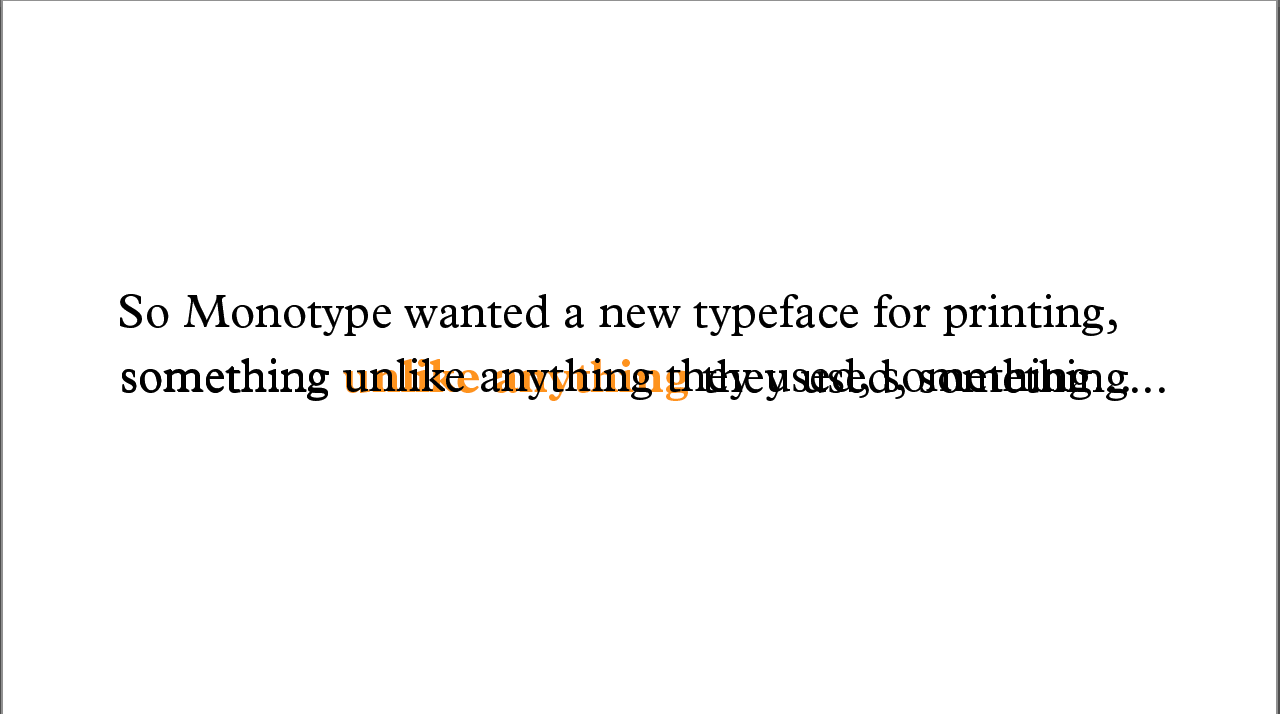
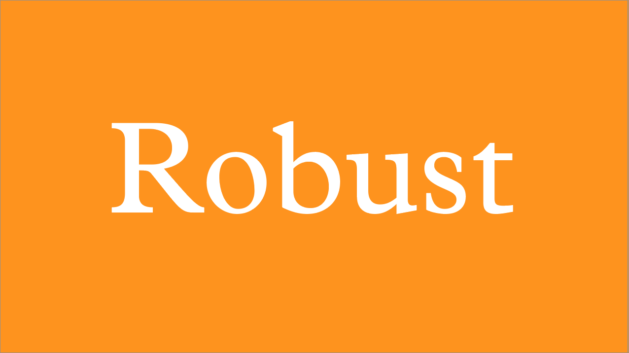

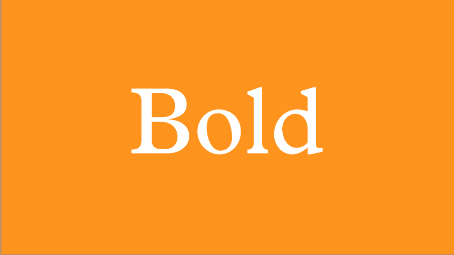
I made around 20 seconds of video for Thursday’s class that included the introduction and a bit of the second scene of my storyboard. I didn’t love the start; it felt slow and repetitive and there wasn’t enough happening to really be engaging. At the time, I only had one line of text appear at a time and then whatever part I believed was important would change to be bold and orange. However, I did like the change from the slowness and quietness of the beginning to the flashes of “Robust,” “Solid,” and “Bold” following that.
Vicki’s first comments for me were to think about changing up the colors, maybe using the blue, a warm grey, and white instead of the white, blue, and orange I was planning on using. She thought that the orange was too bright and a bit hard to look at. Sherri disagreed with this, and she believed I should limit my colors to blue, white, and black. The warm grey didn’t provide enough contrast to the white, and again, the warmth seemed too friendly. After playing around with the color pallet a bit, I decided to keep my original colors, but invert their uses in order to keep large amounts of orange off the screen at a single time.
Vicki also believed that the elements on my screen were moving too fast and I needed to slow it down for the audience to absorb what is happening.
Sherri thought that I could do more with my introduction; she suggested that I try to fully commit to the idea of imitating the hot metal typesetting system to better inform the audience what it was and to make the intro more engaging.
12.5.19
I continued to work focusing on finishing the video instead of fixing details. The only thing that I had changed from my original storyboard was the second to last storyboard scene. I wanted to highlight the ironies within the typeface because that was something that I really liked about it, and Plantin has different weights that I could also show off during that time.
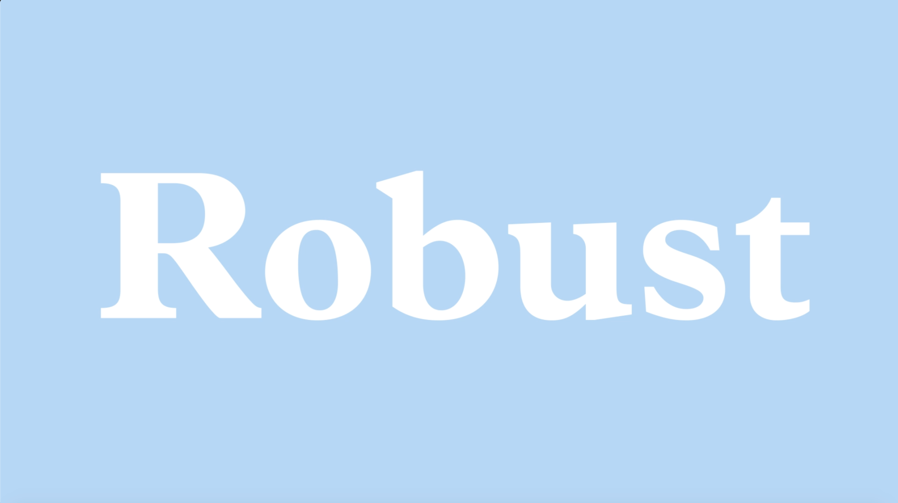
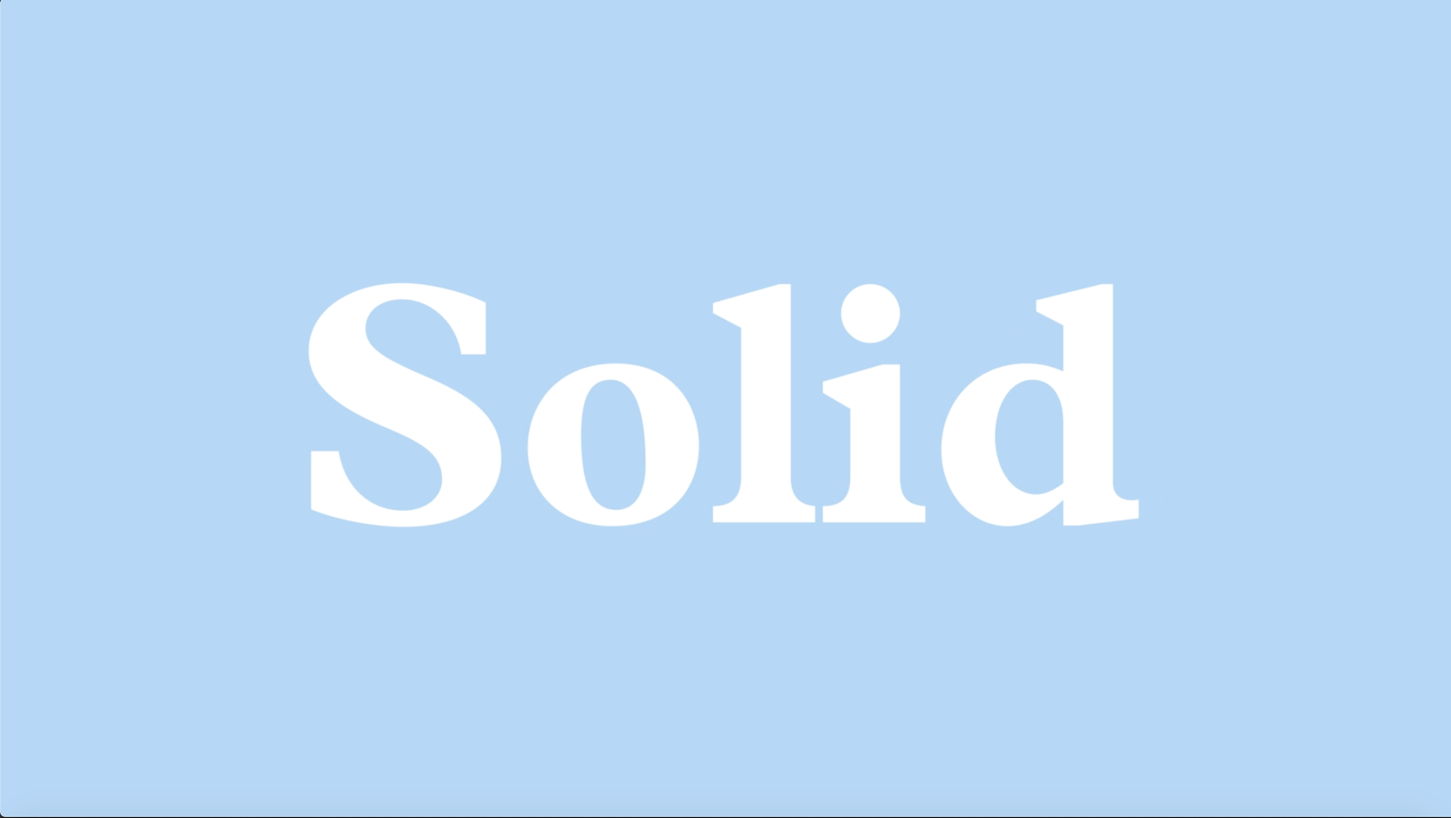


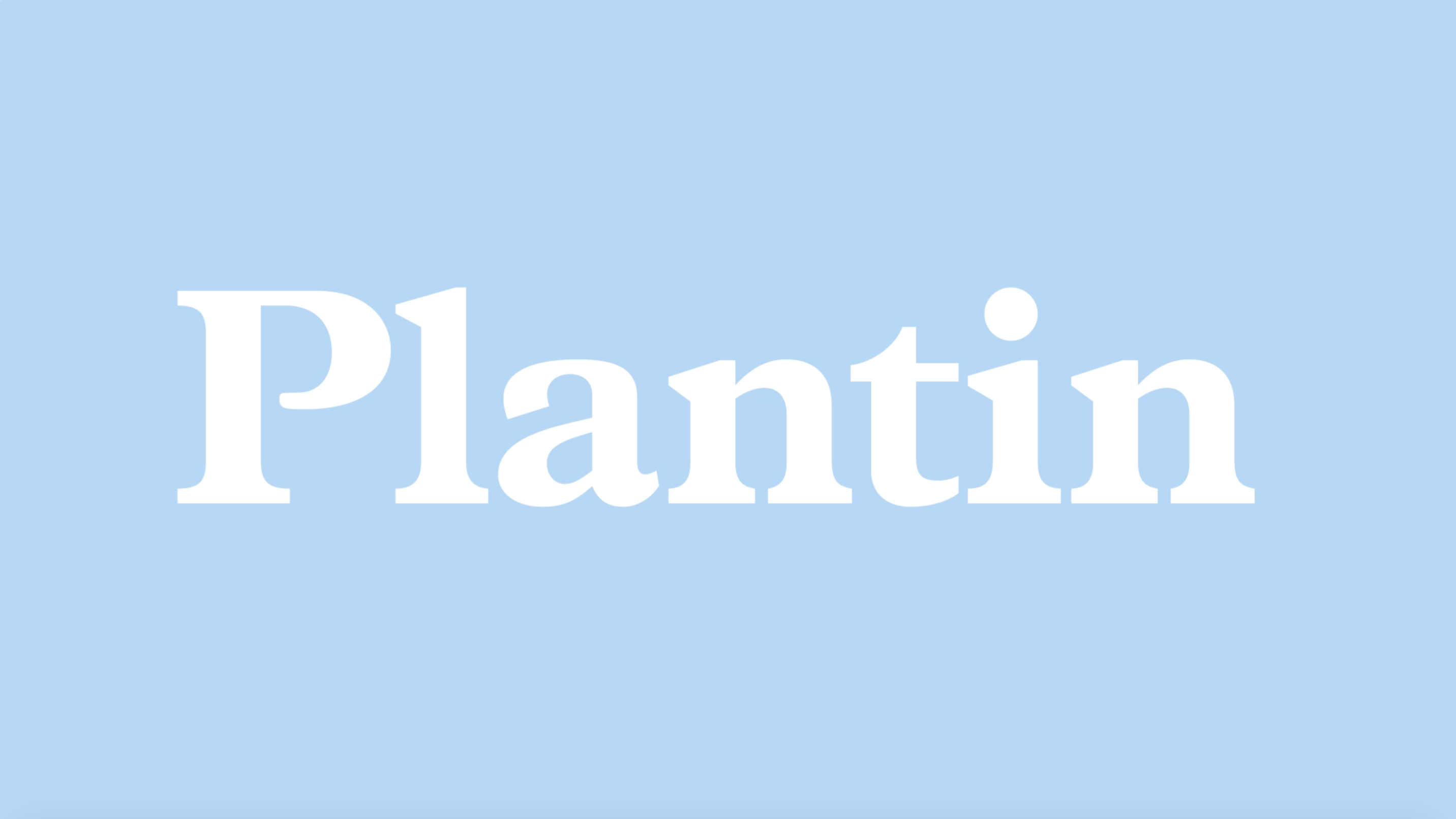
I ran into the issue of time. I planned out the storyboard to music as Sherri suggested, but the issue was that I knew what instruments I wanted to accompany each part of the video, so it required a lot of cutting the sound. Therefore I did not have a good understanding of how much time everything was. By the end of the day, my video ended up being around 45 seconds long—I needed it to be at least 50 seconds. I was hesitant to change anything because the music had a lot of nuanced areas where one would be able to tell that there was an interruption in the sound, and I worked out the transitions from scene to scene pretty well.
12.6.19
I met with Sherri for her office hours. She liked mostly every part of the video except for the introduction. She still suggested I try to imitate the hot metal typesetting system to both explain it and to add time to the beginning (that was the area it would make the most sense to cut the music). She thought that the new “ — — yet — — “ worked nicely with the video.
For the rest of the day, I tried to make the new typesetting system introduction. It helped to add time, but I tried to simplify the process by not adding any of the external elements, which I think made it more unclear what was happening. I do believe it was more interesting, but it made the intro overly complicated and confusing. However, I kept it in to meet the time limit. I chose not to touch anything else to see what Vicki’s opinions were the next day.
12.7.19
Vicki’s notes from our one on one:
- printing not working for intro; try simplifying again, only giving the audience a little to read at a time — play around again with highlighting certain parts of text too
- change the size of some text (too big at parts; stay consistent between scenes)
- change “… running text text text text text” to my essay
- Slow down some areas to make it more comprehensible
- check colors (might just be the big screen)
I decided to then change the intro from the printing to just adding the words onto the screen one by one. Each of my line lengths happened to work well if they went onto the screen to the beat, so it worked out well. Having one word be shown at a time helped to reduce the stress of having to read so many words in a limited time before they disappeared, and it forced the eye to track across the screen, adding more visual interest. The other changes were quick keyframe adjustments which was easier.
Link to final video below: